Wednesday, April 29, 2009
Anatomy of a Product Photo Shoot - Part A - Begin at the End.
The first thing I ask my clients, when they come to me with a shoot idea is, "where is the picture going to be used?" Almost always, they have a specific plan as to why they want this image. It could be a brochure or sell sheet, web page or direct mail card. Or a combination of many uses.
How they plan to use it is very important to how we create the image. If the image is solely going to be used in a product catalog, then the image needs to be designed so that it can share attention on a page with other products.
However, if it is for a press release or publicity release about the product or company, or if it is for an ad or trade show sell sheet, then the final photo illustration has to practically jump off the page to get a potential buyer's attention.
The plan and rational for each decision about why we are making the image directly impacts how we produce the image.
More about the Anatomy of Product Photography next time!
Posted by Matt McKee Photography at 7:29 AM 1 comments
Labels: commercial photography, editorial photography, industrial photography, Product photography, still life, table top
Monday, March 16, 2009
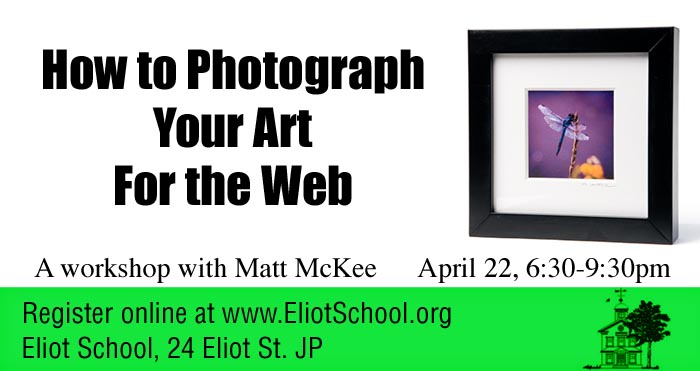
How to Photograph your Artwork for the Web
In this age of digital submissions, an artist needs to know more than just how to paint, draw, sculpt or otherwise create. More and more shows and contests are running their jurying process via the web.
This seminar, which takes place at the Eliot School, in Jamaica Plain, is designed to help take the sting out of learning how to take good digital photos of your artwork (without spending a ton of money on gear), how to get the image ready for uploading to the web (without photoshop) and how to make sure your digital image is around when you need it in the future!
If you are an artist in the Boston area, this is the seminar to see. It takes place on April 22nd at 6:30pm.
Sign up for the workshop at eliotschool.org and check out their other marketing workshops as well.
Some of the topics covered in this workshop:
- What is a pixel and what is resolution and why should I even care?
- How can I make my camera do what I want?
- What should I do with the pictures?
- Is there a simple way to do this? (the answer is yes!)
Posted by Matt McKee Photography at 11:04 AM 0 comments
Labels: artist, eliot school, fine art, jamaica plain, Jamaica Plain Open Studios, marketing, photography, workshop
Monday, March 09, 2009
I love the photograph but what do I do with it?
Yes, I get that not every photograph has to be a museum piece. Sometimes, a product is just a product. But, shouldn't the photoshoot be the best value that you can get?
I don't mean "spend as much as you can." That would be silly, self serving, and, ultimately, deadly for my business.
The value, as any entrepeneur can tell you, is not just in the final object (photo, product, whatever). It is in the process, in the plan, and in the execution.
Many times, the story I have been told runs like this: "We did it ourselves. Twice. And, it was okay but...[retouching fees, didn't look quite like x...] "
Or: "We found this picture online. It was short money. We put it on the cover of our brochure. [So did our competition, it was too generic, it wasn't our product/people/service]."
Even worse: "We downloaded this picture from someone's photo sharing site. And, now we have a cease and desist letter, plus a court date."
So, you love the portfolio, but it isn't quite your product type/looks real artsy/looks expensive. That's okay.
What you do with it is use it as a conversation starter. Find a photo that is nice and ask the photographer the key question: "If you were going to photograph my product, how would you approach it?"
If the photographer asks about the goal of the photograph, the value of the image to you, your company and your potential customers, you have someone who will collaborate with you and work the intersection of art and commerce to your advantage!
--
The picture of the custom built motorcycle above was created in an iron fabrication company down in Rhode Island a few years ago. We used a combination of light sources to get the nice highlights, including a 12' by 12' silk on two high boy stands on the camera left. On camera right was the biggest softbox I had in my collection. Various white and silver cards were distributed around to keep the highlights clean. A smoke machine gave us the atmosphere in the background and the light streaming in through the windows was courtesy of Mother Nature.
Posted by Matt McKee Photography at 7:50 AM 0 comments
Labels: advertising, commercial photography, industrial photography, lighting, location photography, matt mckee, motorcycle
Tuesday, February 24, 2009
It's just a simple Product Photograph!
Well, yes... and no!
A product photograph, from our little photo studio, just outside of Boston, is almost always a combination of collaborative thinking, careful interviewing and preplanning.
This beautiful, art deco style lamp would look good on almost any background. However, looking around the show room during our initial conversation with the client, we quickly decided that the image needed to carefully reflect an old world warmth and quality.
Back at the studio, we pulled out a canvas background we had created a while back. It consisted of an application of a material called Instant Rust. I had remembered that the application had turned out with a nice, painterly quality that reminded me of the old masters' paintings of bowls of fruit and other still life compositions.
The lamp itself, with its round top, projected a warm glow that we needed to imitate in the shot. Also, with all that chrome, we needed to figure out how to create smooth, uninterrupted highlights.
The set was built in a small room, with the 4'x8' canvas swept out across the floor. A strobe head with a grid and warming gel was targeted on the background and adjusted so that the light looked like it was coming from the lamp. A second strobe, shot through a 3'x6' sheet, became our main light to the right of the camera. And, a large white card was added on the left to give us the highlight on the left side of the shaft. Some time was spent balancing the exposure for the incandescent bulb in the lamp and the strobes.
There was a conversation about the light switch. Do we show it or not? Since it was, ultimately, part of the design and usability of the product, we included it.
Posted by Matt McKee Photography at 7:52 AM 0 comments
Labels: advertising, branding, catalog, commercial photography, industrial photography, marketing, matt mckee, Product photography
Monday, February 09, 2009
Digital Illustration in Product Photography
Pre planning a product photograph is the best way to get the maximum impact for your buck.
Many of the conversations I have with potential clients start out with them calling me up and asking, "How much?"
And, I always feel a little bad when I have to ask "For what?"
I am not being a wise guy. I am not making fun of them. I am simply trying to identify what their goal is for the product shot.
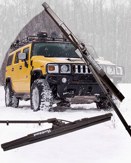
For example, the digital illustration above was created to be used with a press release that would go out to all of the automotive trade magazines. Our goal, therefore, was to create an image that would appeal to the magazine editors.
It had to:
The shot would also be used for their catalog and other sales collateral. But, since the editorial use came first, that was what we designed and optimized the photograph for.
We started with a "napkin" plan, a sketch of the elements of the shot jotted down on a piece of paper. This was our blueprints for the rest of the production. Without this step, we could have spent hours or even days, going back and forth, trying to come to a meeting of the minds, wasting time and money.
Instead, we knew what angle the client liked best angle, we knew where the "sweep" should be. And, we knew what kind of a stock shot in the background would appeal to our target audience.
The setup, in my small photo studio, just outside of Boston, was fairly simple. We only had one wiper, since this was a prototype. We shot it twice, using a nice broad light to give us smooth highlights. In post production, we set up the stock background and knocked out the background on the two wiper shots.
The whole shoot and post production was around three hours. But, we couldn't have done it that quickly, or efficiently, if we hadn't started with a plan.
Posted by Matt McKee Photography at 8:21 AM 0 comments
Labels: commercial photography, digital, Product photography, publishing photography, table top
Friday, February 06, 2009
Boston Product Photography Blog restart
Okay, so I really haven't been slacking here, despite what you may think. My studio is a multifaceted beast that takes on all kinds of photography and photo illustration projects. For the last however many months, I have been redeveloping the mckeephotography.com site to more fully reflect one particular side of my commercial photography.
And, while we were at it, we started another blog at blog.mckeephotography.com to show off some of our more digitally manipulated and conceptual images, many of which are also available as stock photos from photoshelter.
So, why are we resurrecting the blogspot photography blog? One thing we do a lot of here in my little photo studio in Dedham, is capture the functionality of a product.
I like to think of it as table top photography that is designed to illustrate the soul of an engineer's or entrepreneur's design. The product shot needs to show the audience why the widget was thought up and what problem it solves.
Not always an easy task and even the simplest looking photo goes through a lot of thought and back and forth before we start setting up.
Stay tuned, gentle readers, and we will talk about product photography in the future posts!
Posted by Matt McKee Photography at 7:57 AM 0 comments
Labels: advertising, Boston, commercial photography, industrial photography, marketing, Product photography, still life, table top