Showing posts with label marketing. Show all posts

Monday, March 16, 2009

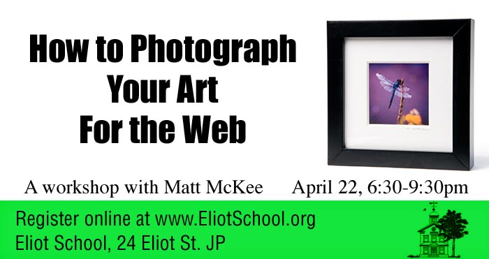
How to Photograph your Artwork for the Web

How to photograph your artwork for the web workshop at the Eliot School


In this age of digital submissions, an artist needs to know more than just how to paint, draw, sculpt or otherwise create. More and more shows and contests are running their jurying process via the web.

This seminar, which takes place at the Eliot School, in Jamaica Plain, is designed to help take the sting out of learning how to take good digital photos of your artwork (without spending a ton of money on gear), how to get the image ready for uploading to the web (without photoshop) and how to make sure your digital image is around when you need it in the future!

If you are an artist in the Boston area, this is the seminar to see. It takes place on April 22nd at 6:30pm.

Sign up for the workshop at eliotschool.org and check out their other marketing workshops as well.

Some of the topics covered in this workshop:
- What is a pixel and what is resolution and why should I even care?
- How can I make my camera do what I want?
- What should I do with the pictures?
- Is there a simple way to do this? (the answer is yes!)

Tuesday, February 24, 2009

It's just a simple Product Photograph!

art_deco_lamp.jpg

Well, yes... and no!

A product photograph, from our little photo studio, just outside of Boston, is almost always a combination of collaborative thinking, careful interviewing and preplanning.

This beautiful, art deco style lamp would look good on almost any background. However, looking around the show room during our initial conversation with the client, we quickly decided that the image needed to carefully reflect an old world warmth and quality.

Back at the studio, we pulled out a canvas background we had created a while back. It consisted of an application of a material called Instant Rust. I had remembered that the application had turned out with a nice, painterly quality that reminded me of the old masters' paintings of bowls of fruit and other still life compositions.

The lamp itself, with its round top, projected a warm glow that we needed to imitate in the shot. Also, with all that chrome, we needed to figure out how to create smooth, uninterrupted highlights.

The set was built in a small room, with the 4'x8' canvas swept out across the floor. A strobe head with a grid and warming gel was targeted on the background and adjusted so that the light looked like it was coming from the lamp. A second strobe, shot through a 3'x6' sheet, became our main light to the right of the camera. And, a large white card was added on the left to give us the highlight on the left side of the shaft. Some time was spent balancing the exposure for the incandescent bulb in the lamp and the strobes.

There was a conversation about the light switch. Do we show it or not? Since it was, ultimately, part of the design and usability of the product, we included it.

Friday, February 06, 2009

Boston Product Photography Blog restart

fireman_mckeephoto.jpg


Okay, so I really haven't been slacking here, despite what you may think. My studio is a multifaceted beast that takes on all kinds of photography and photo illustration projects. For the last however many months, I have been redeveloping the mckeephotography.com site to more fully reflect one particular side of my commercial photography.

And, while we were at it, we started another blog at blog.mckeephotography.com to show off some of our more digitally manipulated and conceptual images, many of which are also available as stock photos from photoshelter.

So, why are we resurrecting the blogspot photography blog? One thing we do a lot of here in my little photo studio in Dedham, is capture the functionality of a product.

I like to think of it as table top photography that is designed to illustrate the soul of an engineer's or entrepreneur's design. The product shot needs to show the audience why the widget was thought up and what problem it solves.

Not always an easy task and even the simplest looking photo goes through a lot of thought and back and forth before we start setting up.

Stay tuned, gentle readers, and we will talk about product photography in the future posts!

Monday, August 25, 2008

Meet NESSC

mckee_080620_9295.jpg

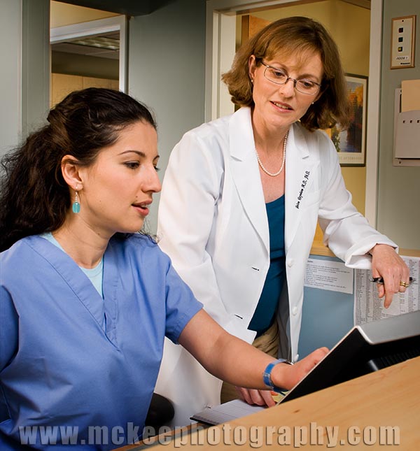
Meet Gabe. Meet Dr. Raynhem.

Soon, there will be a new web site for Dr. Raynhem's practice, along with new collateral pieces featuring images like this one, showing the staff as real people, interacting with each other and with the patients.

This was a fun project, made all the better for the fact that we had worked together on Dr. Raynhem's first marketing projects two years ago, when we turned her kitchen into a medical office for the day!

This project also gave me an opportunity to work with Margina Dennis again. She is a very talented hair and makeup artist and an asset to any shoot.

Sunday, January 27, 2008

Executive Portraits are marketing tools, too.

mckee_080124_0240.jpg

A graphic designer/marketing guru friend of mine invited me in to her office to talk about creating some portraits that would work for a marketing/branding project.

She had observed that press releases had a higher percentage of success when an image was included. And, that the type of image presented had an almost direct influence on how big the article was presented on the page.

She was quick to point out that there were a lot of other influences and variables that play a significant roll in the success rate as well. In no particular order: how well the press release was written, how much the release was aimed at the publication's target audience, how unique the article was, what other news, happenings or releases were competing for the same space, how much the editor had on his/her plate when the release came in, how much work they had to do to make the article work, etc...

We talked about the pros and cons of different types of headshots. The most common type are the studio shots, on neutral backgrounds, sometimes on a painted background. They are literally head and shoulder images. The pros are that they can be done fairly quickly and inexpensively. Several people can get theirs done if the photographer comes out to the office and can set up in a convenient conference room. Everyone's image looks pretty much the same, which works well for proposal documents, web bios etc.

The cons start with everyone looking the same. Not only do they look the same for the office, they often look the same as everyone else's in the world. Some nicknames for these images are school photos, passports and drivers license photos. Also, because speed is an issue, sometimes people don't look their best ie: unwrinkled cloths, matching cloths, hair, shiny faces, etc.

The next level up was studio style but with the addition of a stylist/groomer. The sessions for each person go a little longer but they end up looking much better.

2428_k_122.jpgIn an image that relies totally on the person's personality to shine through (remember: generic, neutral backgrounds, no props etc) every little bit helps to make the shot more effective.

Another con that came up was that these images, if published, will only get postage stamp size space in the publication. If you are looking for a cover story or a full page section opener or even a half page article, these images probably won't impress an editor.

2428_B_138.jpgSo, the other option is the custom portrait. The pros for this type of image is that you can get away from looking like everyone else and can collaborate to create an image that is an effective story telling tool for your marketing (which should be the goal of these images, right?).

The cons? Well, it is more expensive, in the short run. There are things to consider like grooming, wardrobe, location, etc. The production time can be longer and take up more of your time. And, a big one is that the photographer will ask you to share some information that you may not have thought of. Such as, who is your audience? How do you want them to feel when they look at this image? and, how do you see your self?

I brought these cons up to my marketing friend, having heard them from customers and potential customers for years. She said, "Yes, but they are only cons if you are afraid of success. Won't a better image be more effective and then, directly or indirectly, make you more money? Be more effective with your marketing?"

What could I say to that?

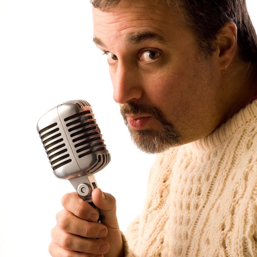
The big picture above is a direct result of that conversation. I can't reveal who it is for yet, but... The smaller pictures were done for Cambridge Healthtech Advisors. They opted to do both types of images to give them more marketing flexibility.
Friday, November 09, 2007

House Style?

2393_201_1.jpg

Branding is always an interesting exercise and something that every company should take a look at. Because, no matter what, you are a brand to your customers/audience.

The really interesting part is when you discover that what you think your brand stands for is not what they think your brand stands for.

For example, an excellent graphic designer and branding expert, Christine Conrad Lane, commented that one of my selling features was "No specific house style."

That freaked me for a moment. And, then she continued with "That is important to me." She needs someone who is flexible and skilled enough that they can tell the story that meet her clients' goals.. with whatever tools, props, looks or style that is appropriate.

She finished her branding statement of my photography with "Matt McKee Photography captures reflections of the reality you desire."

Which, come to think of it, is how I see my photography as well!

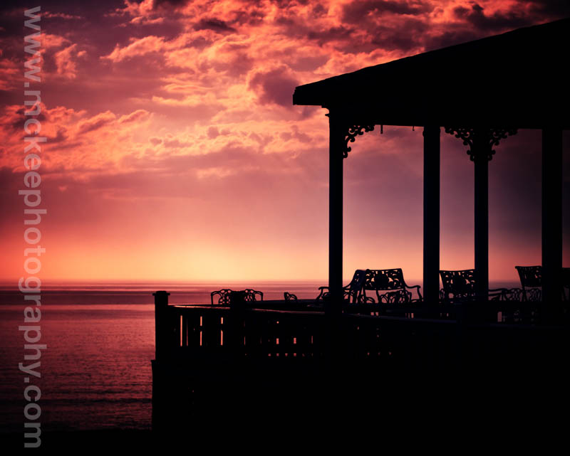
The image above was originally created for the Spring House on Block Island, art directed by the Hue Brand Group. The original file, as shot, was a nice porch image. But, to get the "reflection of reality that [a potential hotel guest would] desire," I needed to take it further.

Hope you enjoy it!

Monday, November 05, 2007

A Good Marketing Quote and Hair

Hair PosterD.jpg

I was sitting in a client's office the other day, talking about an upcoming project for a concept based still life. The conversation rolled around to the effectiveness of cutting back on marketing to save a buck.

He pulled out a piece of paper with one of the most apropos quotes I have seen in a long time.

"He who stops advertising to try and save money could just as easily stop his watch to try and save time."

Neither of us know who said it. He got it from one of his clients. If you know who to credit for it, let me know!

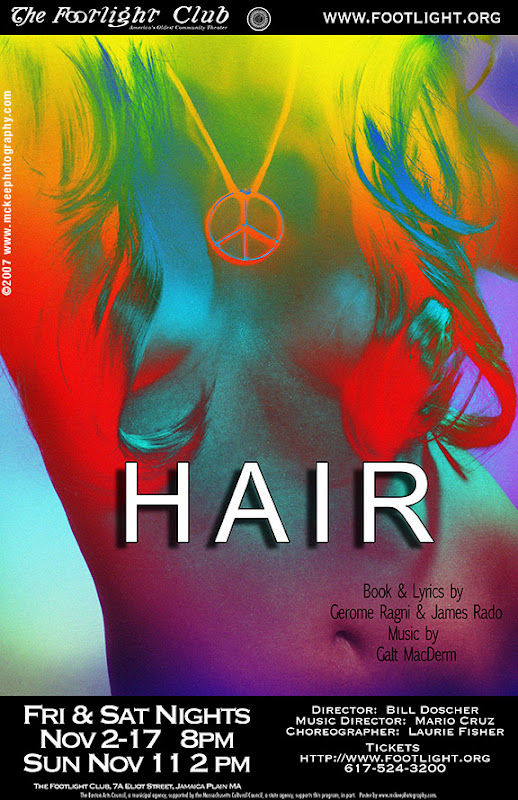
The poster above is another in the series I have been creating for the Footlight Club, America's Oldest Community Theater.

As always, a lot of fun and creativity went into the preplanning for the shoot. In retrospect, the shoot itself was kind of quiet, as Jason, the stylist on set and our model, wrestled with the wigs to get strategic coverage.

Speaking of good marketing quotes, I found a very interesting article on the Freelanceswitch.com site that talked about marketing and publicity design. It was specifically about designing for publicity, but, like most marketing, the principles can apply anywhere!


Tuesday, October 30, 2007

A Night in the Village Remembering

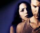
9856-9 twin scream.JPG

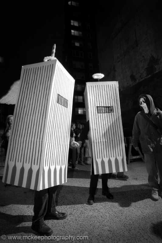
This image was created on Halloween 2001. We followed this couple for about 7 blocks.

There was plenty of cheering and not a few tears from passers by and fellow costumed characters.

Tuesday, August 07, 2007

Cat on a Hot Tin Roof


Ugh! August in Boston. 90 degrees and sweat pouring down.

It's a little like the scene we recently created above.

This was part of a poster and marketing project for The Footlight Club, and another opportunity for me to work with the wonderful and passionate people there.

We started out studying the classic posters and dvd covers from the Paul Newman movie and reading over the synopsis of Tenessee William's play. And, then we distilled it down until we answered the questions, what is the ultimate theme and what is the audience going to be looking for?

In the beginning of the process, the layout was very busy and full of people. By the end, when we showed up to shoot, it was just Brick and Maggie, played by Peyton Pugmire and Elissa Jordan. Both put on their characters and played the moment to perfection. Susanna Crampton, the producer, and Artie Leger, the director, were both on hand to approve the final shot.


If you want to see great community theater, check out the play at the Footlight Club.

Monday, May 14, 2007

Posters and Composites

One of my constant inspirations is the art of the movie poster. Where else does the art of compositing come together to express the idea of a two hour span of time? It makes heros and villans larger than life. It conveys the central theme and drama (or comedy or whatever) to an audience through the common visual language. It is a dialog that happens in one composition.

For a while now, I have been exploring this art with a local community theater. (Yes, the same one that I just completed a 31 portrait series of its members. You can still order the book by clicking the link to the right.)

Once again, I was able to team up with Kristin MacDougall, on of the fine producers at the Footlight Club, and we brainstormed a poster design for Vampire Lesbians of Sodom and Sleeping Beauty or Coma, two Charles Busch plays.

Principle photography took place over a few short hours, photographing the available actors, in costume, on a white background. Compositing and final design, however, took around 6 hours to put together the poster and banner to advertise the show.


This makes my sixth poster series for the club and I look forward to our next project together!

Tuesday, January 30, 2007

It's Official!

Found at the Beach has officially been launched at lulu.com.

During the spring of 2006, we took a family vacation to visit some of our relatives whom we haven't seen in a long while. We traveled down to North Carolina and toured back up through Maryland and finally back up to Boston.

Every time we take one of these trips, I am fascinated by my children's reaction to the new input of ideas, scenes and situations. And, I reflect back to my own memories of my parents taking me and my brother on similar excursions.

Every time we take one of these trips (both when I was a child and now), we invariably end up at the shore at some point.

And pockets get filled with sand, shells and other little treasures.

This book was inspired by all of those trips. The work is an exploration of all of the wonderful bits and pieces that I collected.

It is also a journey back to my roots in photography. I started out doing table top sets in my living room and garage, following instructions I found in the old Peterson's Photographic Magazines, when I was a teenager. During my formal education at the Rochester Institute of Technology, I also spent most of my time playing the roll of a small god in a dark room, setting up still lifes and table top sets. It wasn't until my senior year that I realized the lessons I was learning with these images would apply to any other story telling image: light, composition, subject matter.

My boys and I took another trip recently, up to my parents' place on the coast of Maine. For some reason, we decided to do a winter trip to the beach at Reed State Park. And, once again, we came out with cool bits that are inspiring me to continue the series.

In any case, I hope the images tempt you and that you enjoy the book!

Matt

Tuesday, December 19, 2006

Reflections at the Footlight Club

The book project is almost done!

Last Saturday, we completed the final photography and started laying out the actual book.

The people in the photographs are getting their stories in to me and we hope to have it all completed and ready for the printer by the end of January.

For those not familiar with the project, I set out to document the current members of the Footlight Club, America's Oldest Community Theater, in Jamaica Plain, MA. I wanted to capture them in their self assigned roles, and learn about how and why they became involved in this institution.

The book, due to be published through Lulu.com, is going to be used as a fund raising tool and marketing tool for the group.

Stay tuned to find out about the actual publish date and the kick off party at the theater in April.

The photo above is Tonee, one of the stage managers at the club.

Thursday, December 14, 2006

My Memories of Christmas

(as posted on the Ad Club Blog)

My favorite memories of Christmas... Well, it would have to be the mysterious and wonderful adventures at Grandma's house before I was 10 years old.


We would get up at our house and open our presents, rush through breakfast and get on the
road. After an hour drive over the berkshires, we would arrive at bedlam.

My grandmother must have been cooking for days preparing for the day. Walking into the kitchen, the senses were assaulted by smells of delicious food, cries of joy and welcome, and warmth from the stove that was putting out still more delectables.


Moving into the parlor, my younger brother and I would spy on the tree and see how many presents were stacked there. Because Grandma's was the central meeting point for 5 or 6
generations, plus various neighbors, it would seem to our eyes to be an ocean of wrapping paper and bows.

And then there would be the den. If the kitchen was the gossip point for the mothers, grandmothers, aunts and older neices, the dark, cave-like den was for the men. The tv constantly buzzing with bowling, wrestling and then football. The smell of smoke and whiskey, the feel of stubbly hugs and talk of arcane sporting terms and who was doing what at Sprague Electric.


It seemed to be two worlds, the den and the kitchen, with constant traffic in food and drink moving between, through the kids world: the Parlor.

It was a strange and magical time. The kids, my cousins, brother and I, would make forts, eat chicken and rice, steal cookies, ogle the presents, eat some more of whatever we could sneak, rest and spy on the adults, all the while, anticipating tearing into the huge pile of presents.

Looking back now, I can hardly remember the presents or the unwrapping. My memories center around the warm feeling of belonging, surrounded by famly, the friendly chaos, of being sated and happy with the promise of more good things to come.

As a father of two boys, I watch them each Christmas and wonder what they see now and will remember of our times together.

The snaps here are from last year's celebration. Hunter got a snowman kit and wasted no time in putting it to use at my parents' place in Maine.

sponsor