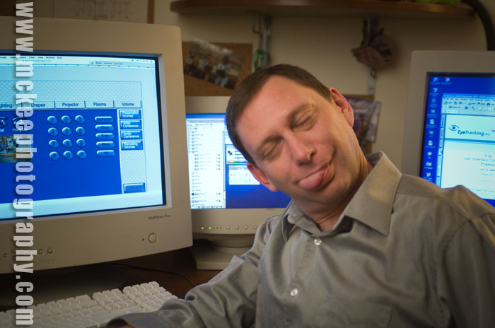
Yes, we're back to the tongues.
I was looking through the archive for some other images and came across this little gem of a portrait of a good friend of mine who was just starting out his business and wanted a unique portrait instead of the industry standard, driver's license/passport photo headshot.
Of course, this was not the one he chose for his publicity campaign!
We started out with a very serious looking image and gradually broke it down until we were just laughing out loud about bad jokes (mostly mine).
Eventually, we came around to more casual expressions and captured some real expressions.
He said something interesting about the process and the goal of the shoot. He said that, while the photo was of him and looked like him, its reason to exist wasn't about him. As a personal photo, he didn't really like the portrait because, well, he wasn't 18 years old, etc. I can relate.
The important measure of success for the photo was how it would appeal to his target audience. Would they like it? Would they feel comfortable with this image? Would it help them to feel comfortable hiring him? Did it have the elements (props, wardrobe, expression, background, lighting, pose, etc) that would help the audience identify with him?
That would be the true measure of a successful marketing portrait.
But, I still like the tongue shot!
Tuesday, February 05, 2008
Back to the Tongues
Posted by
Matt McKee Photography
at
8:07 AM
![]()
![]()
Labels: advertising, bloopers, composite, corporate, executive portraiture, head shots, oops, outtake, photography, portrait, Real people portraits
Subscribe to:
Post Comments (Atom)


Now that's a fun shoot!
ReplyDelete