Showing posts with label advertising. Show all posts

Monday, March 09, 2009

I love the photograph but what do I do with it?

motorcycle1_mckeephoto.jpg
I get this question sometimes, when I am talking about my photography to owners of companies who are, understandably, more concerned about making payroll than discussing where art and commerce intersect (that's marketing at its finest, folks!). I also get it from graphic designers who are used to responding to orders from their clients.

Yes, I get that not every photograph has to be a museum piece. Sometimes, a product is just a product. But, shouldn't the photoshoot be the best value that you can get?

I don't mean "spend as much as you can." That would be silly, self serving, and, ultimately, deadly for my business.

The value, as any entrepeneur can tell you, is not just in the final object (photo, product, whatever). It is in the process, in the plan, and in the execution.

Many times, the story I have been told runs like this: "We did it ourselves. Twice. And, it was okay but...[retouching fees, didn't look quite like x...] "

Or: "We found this picture online. It was short money. We put it on the cover of our brochure. [So did our competition, it was too generic, it wasn't our product/people/service]."

Even worse: "We downloaded this picture from someone's photo sharing site. And, now we have a cease and desist letter, plus a court date."

So, you love the portfolio, but it isn't quite your product type/looks real artsy/looks expensive. That's okay.

What you do with it is use it as a conversation starter. Find a photo that is nice and ask the photographer the key question: "If you were going to photograph my product, how would you approach it?"

If the photographer asks about the goal of the photograph, the value of the image to you, your company and your potential customers, you have someone who will collaborate with you and work the intersection of art and commerce to your advantage!

--

The picture of the custom built motorcycle above was created in an iron fabrication company down in Rhode Island a few years ago. We used a combination of light sources to get the nice highlights, including a 12' by 12' silk on two high boy stands on the camera left. On camera right was the biggest softbox I had in my collection. Various white and silver cards were distributed around to keep the highlights clean. A smoke machine gave us the atmosphere in the background and the light streaming in through the windows was courtesy of Mother Nature.

Tuesday, February 24, 2009

It's just a simple Product Photograph!

art_deco_lamp.jpg

Well, yes... and no!

A product photograph, from our little photo studio, just outside of Boston, is almost always a combination of collaborative thinking, careful interviewing and preplanning.

This beautiful, art deco style lamp would look good on almost any background. However, looking around the show room during our initial conversation with the client, we quickly decided that the image needed to carefully reflect an old world warmth and quality.

Back at the studio, we pulled out a canvas background we had created a while back. It consisted of an application of a material called Instant Rust. I had remembered that the application had turned out with a nice, painterly quality that reminded me of the old masters' paintings of bowls of fruit and other still life compositions.

The lamp itself, with its round top, projected a warm glow that we needed to imitate in the shot. Also, with all that chrome, we needed to figure out how to create smooth, uninterrupted highlights.

The set was built in a small room, with the 4'x8' canvas swept out across the floor. A strobe head with a grid and warming gel was targeted on the background and adjusted so that the light looked like it was coming from the lamp. A second strobe, shot through a 3'x6' sheet, became our main light to the right of the camera. And, a large white card was added on the left to give us the highlight on the left side of the shaft. Some time was spent balancing the exposure for the incandescent bulb in the lamp and the strobes.

There was a conversation about the light switch. Do we show it or not? Since it was, ultimately, part of the design and usability of the product, we included it.

Friday, February 06, 2009

Boston Product Photography Blog restart

fireman_mckeephoto.jpg


Okay, so I really haven't been slacking here, despite what you may think. My studio is a multifaceted beast that takes on all kinds of photography and photo illustration projects. For the last however many months, I have been redeveloping the mckeephotography.com site to more fully reflect one particular side of my commercial photography.

And, while we were at it, we started another blog at blog.mckeephotography.com to show off some of our more digitally manipulated and conceptual images, many of which are also available as stock photos from photoshelter.

So, why are we resurrecting the blogspot photography blog? One thing we do a lot of here in my little photo studio in Dedham, is capture the functionality of a product.

I like to think of it as table top photography that is designed to illustrate the soul of an engineer's or entrepreneur's design. The product shot needs to show the audience why the widget was thought up and what problem it solves.

Not always an easy task and even the simplest looking photo goes through a lot of thought and back and forth before we start setting up.

Stay tuned, gentle readers, and we will talk about product photography in the future posts!

Monday, October 06, 2008

Swimming in a Fish Tank

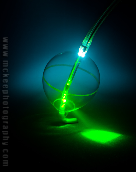
Cardiofocus.jpg

So, how do you get a picture of Cardiofocus's latest Laser Ablation tool?

Start with a 30 gallon fish tank. Add a background. Add about 30 cc's of 2% milk. And then start playing with light!

Just remember, electricity and water make for a very, erm, shocking combination.

Tuesday, June 17, 2008

The third Monkey

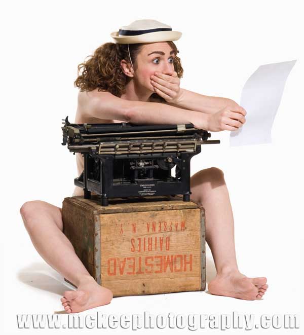
aittmckee_080515_7943.jpg


This here is Alison Beach, military, law student and actor at the Footlight Club.

She and the two previous portraits are for the Footlight Club's All in the Timing.

Monday, May 05, 2008

Power Lunch- Redefined

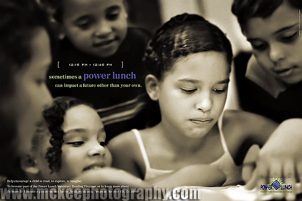
POW-Posters21.jpg

Ah, kids.

Brian Heil, over at Hue Brand Group, creative directed this project, for a non-profit reading program. We had a lot of fun playing with the kids and they, I think, had a lot of fun with us.

The challenge, as always, is to keep their attention span. Or, at least, direct their attention to what we need to accomplish.

I learned a lot from this shoot. One of the kids taught me some of the worst knock knock jokes ever!

Friday, April 04, 2008

The Knightly Arts

mckee_080327_1035Bblog.jpg


Well, this was an exciting shoot! This guy is a practicing swordsman and has won awards around the world. He showed up with two suits of armor and lots of stories.

If you are interested, he runs a school for sword play and other martial arts involving edged weapons. Check it out at http://www.knightlyarts.com.

We are having a conversation about a series of marketing images for the school. Could be really interesting.

Friday, March 21, 2008

The rabbits have invaded my home!

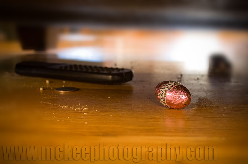
MCKEE_080321_0911.jpg


Omg, it's rabbit season again!

Every spring, they show up on a certain Sunday morning and leave little chocolate droppings around the house for the kiddies to find.

Jacked up on said chocolate, the kids spend the rest of the day climbing the pews at church and then fighting amongst themselves for the last morsel to stave off the inevitable sugar crash.

And, of course, there is always that one little foil covered confection that comes out, covered in dust bunnies and cobwebs, wearing last years (or the year before?) colors.

It was hiding behind the remote that was lost two tvs ago.

Friday, February 22, 2008

Marketing Concepts Over Breakfast or My Favorite Morning Reads

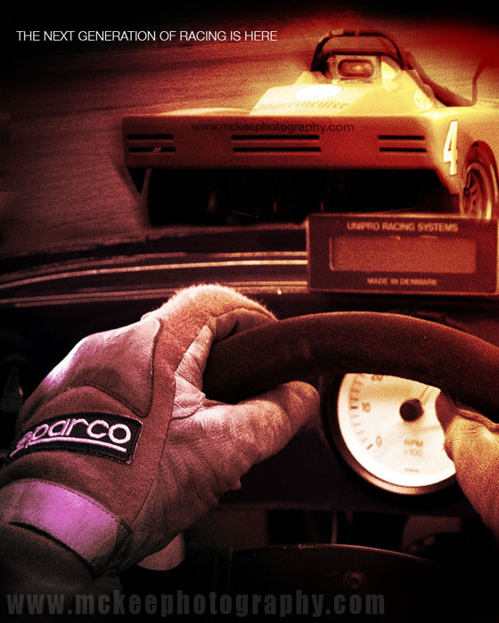
SimRacingPoster.jpg

Each morning, my boys and I sit at the breakfast table and talk about the coming day (if I have had enough coffee) or listen to the latest tunes my eight year old had found on iTunes (if I have had enough coffee). My wife leaves earlier than we do so we have the house to our selves.

While waiting for the school bus, I surf through a variety of blogs to help spark my brain and maybe give me inspiration for the day.

Here are a few favorites of mine:

www.sinfest.net No, it isn't dirty. It is Tatsuya Ishida's cartoon about pop culture. It is an easy read and helps me get started.

http://www.pvponline.com/ Another web cartoon that features characters about my age (or so I imagine). One of them is a mac-lovin', slacker type. Another is a troll.

http://sethgodin.typepad.com/ If you don't know who Seth Godin is, then you probably don't do much marketing. Love or hate his ideas, they certainly can make you think. And, he is not shy about sharing ideas.

http://blog.guykawasaki.com/ As a mac guy, how could I not like Guy. As a student of marketing, he is a must read. Think different, Dude.

Advertising/Design Goodness Sort of a Lurzner's Archive for the internet. Inspiration and clever advertising.

Heartstorming Ian Summer's blog about creativity. What Seth and Guy do for (to) me with marketing, Ian does with creativity.

The image above is a sandwich of two images I captured in New Hampshire. The poster was created for a software company working on a virtual racing simulator. The marketing director really liked the image but the powers that be went in a different direction, orphaning the project.

Ah, well.

Tuesday, February 05, 2008

Back to the Tongues

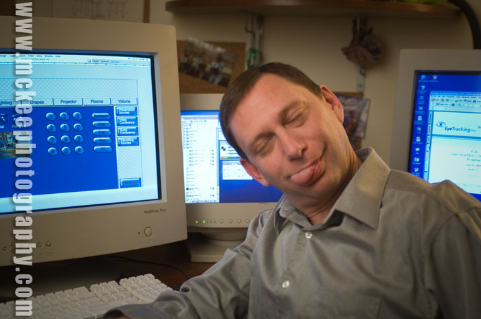
greg.jpg

Yes, we're back to the tongues.

I was looking through the archive for some other images and came across this little gem of a portrait of a good friend of mine who was just starting out his business and wanted a unique portrait instead of the industry standard, driver's license/passport photo headshot.

Of course, this was not the one he chose for his publicity campaign!

We started out with a very serious looking image and gradually broke it down until we were just laughing out loud about bad jokes (mostly mine).

Eventually, we came around to more casual expressions and captured some real expressions.

He said something interesting about the process and the goal of the shoot. He said that, while the photo was of him and looked like him, its reason to exist wasn't about him. As a personal photo, he didn't really like the portrait because, well, he wasn't 18 years old, etc. I can relate.

The important measure of success for the photo was how it would appeal to his target audience. Would they like it? Would they feel comfortable with this image? Would it help them to feel comfortable hiring him? Did it have the elements (props, wardrobe, expression, background, lighting, pose, etc) that would help the audience identify with him?

That would be the true measure of a successful marketing portrait.

But, I still like the tongue shot!

Wednesday, January 09, 2008

Cat Poster in Layers Magazine

0708Cat.jpg

Yes, you have seen this one before. In fact, it was part of an August 07 blog.

However, I just had to brag a bit about getting it into Layers - The How-To Magazine for Everything Adobe.

Of course, as a commercial photographer, you get to see your work in print all the time. However, there is something special about having your work chosen to be published, rather than specifically commissioned. It is like winning a contest.

My bank account would much rather be commissioned, but I still get a warm, fuzzy feeling from the contests. Plus, as I said, bragging rights!

If you have the January/February 08 issue, it is on page 28, in the Digital Canvas section.

Monday, December 17, 2007

Winter is here... Wish I was there...

2392_212B.jpg

As the winter days get shorter and shorter, I find myself working on a new portfolio of images from my various hospitality projects. And, I really want to be there now.

So, the new portfolio is tentatively titled, "Being Here..."

More as it happens.

Monday, December 10, 2007

Create Magazine's 2007 Photographer Showcase

2481_D_151.jpg

If you are surfing the net, looking at commercial photographers, be sure to check out Create Magazine's 2007 Photographer Showcase.

In the print edition, I am on page 90 & 91. In the online version, downloadable from their web site here, check out page 8 and 9.

Yeah, you can look at the other pages, too.

What is cheap photography?

2392_K_101.jpg

This is from another client conversation. We were talking about stock photography versus assignment photography.

One of his in-house designers kept wanting to use images from a royalty free disk. The boss kept adamantly saying no.

Here was his reasoning, as he said it to me.

1. The people always look like models, not our customers, or even an idealized version of our customers.

2. The concept always has to be warped to fit the royalty free image the designer found, which means compromises.

3. Our product is never in the shot. Or if there is something similar, it is still not OUR product. Or, we have to spend time and money retouching.

4. The selection is so big that you end up spending a day looking for the image, a day re-concepting and a day trying to make it all fit together. Again, with compromises.

5. If the designer happens to find an image that fits our marketing goal, it also certainly fits our competition's goal. And, the marketing plan of everyone else who bought the disk. Which means that the image is not unique to us and our customers.

6. If the customer sees that image on our competition's site after ours, who is he going to associate the image with? Not us!

7. Our brand, our marketing, and our company is worth more than a $10 investment. And, we will get a better return, more sales, with a good, custom image.

8. If that $10 image loses us just one potential customer, it has cost us a heck of a lot more than $10 dollars!

The ASMP have a great article about Royalty Free photography available to the public here.

Friday, November 09, 2007

House Style?

2393_201_1.jpg

Branding is always an interesting exercise and something that every company should take a look at. Because, no matter what, you are a brand to your customers/audience.

The really interesting part is when you discover that what you think your brand stands for is not what they think your brand stands for.

For example, an excellent graphic designer and branding expert, Christine Conrad Lane, commented that one of my selling features was "No specific house style."

That freaked me for a moment. And, then she continued with "That is important to me." She needs someone who is flexible and skilled enough that they can tell the story that meet her clients' goals.. with whatever tools, props, looks or style that is appropriate.

She finished her branding statement of my photography with "Matt McKee Photography captures reflections of the reality you desire."

Which, come to think of it, is how I see my photography as well!

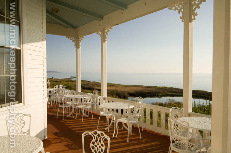
The image above was originally created for the Spring House on Block Island, art directed by the Hue Brand Group. The original file, as shot, was a nice porch image. But, to get the "reflection of reality that [a potential hotel guest would] desire," I needed to take it further.

Hope you enjoy it!

Monday, November 05, 2007

A Good Marketing Quote and Hair

Hair PosterD.jpg

I was sitting in a client's office the other day, talking about an upcoming project for a concept based still life. The conversation rolled around to the effectiveness of cutting back on marketing to save a buck.

He pulled out a piece of paper with one of the most apropos quotes I have seen in a long time.

"He who stops advertising to try and save money could just as easily stop his watch to try and save time."

Neither of us know who said it. He got it from one of his clients. If you know who to credit for it, let me know!

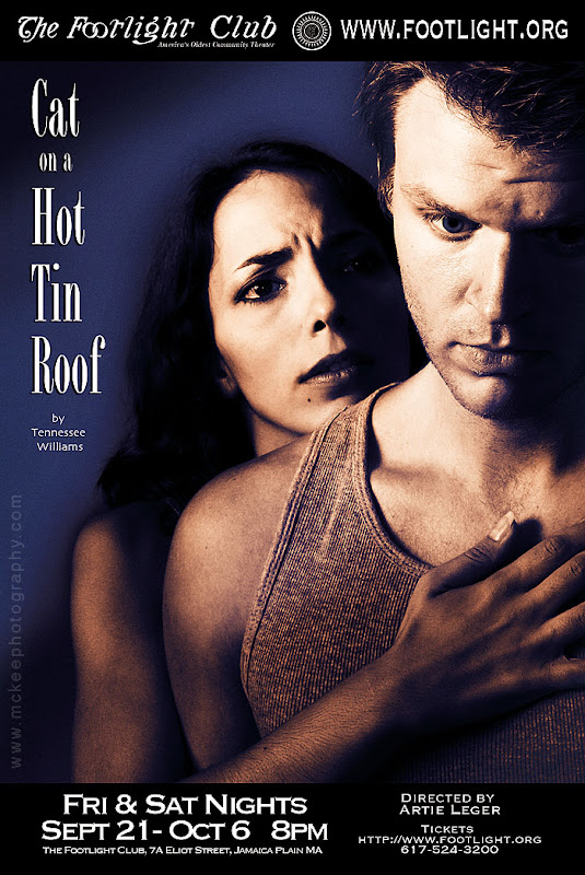
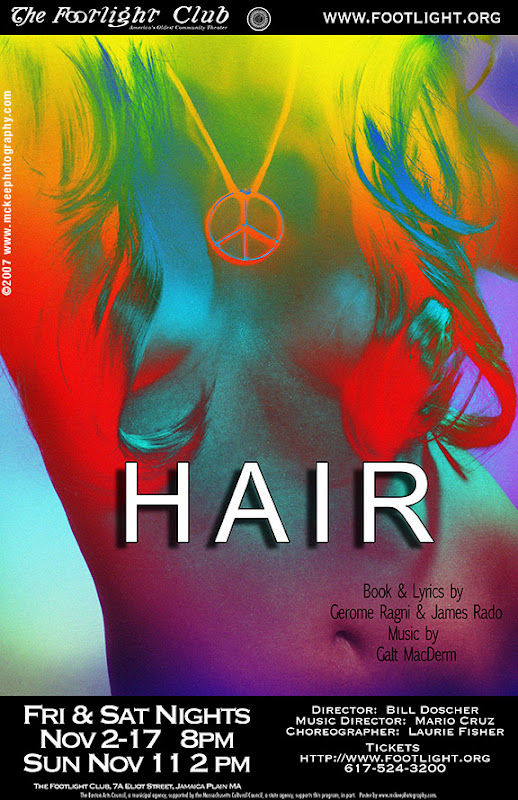
The poster above is another in the series I have been creating for the Footlight Club, America's Oldest Community Theater.

As always, a lot of fun and creativity went into the preplanning for the shoot. In retrospect, the shoot itself was kind of quiet, as Jason, the stylist on set and our model, wrestled with the wigs to get strategic coverage.

Speaking of good marketing quotes, I found a very interesting article on the Freelanceswitch.com site that talked about marketing and publicity design. It was specifically about designing for publicity, but, like most marketing, the principles can apply anywhere!


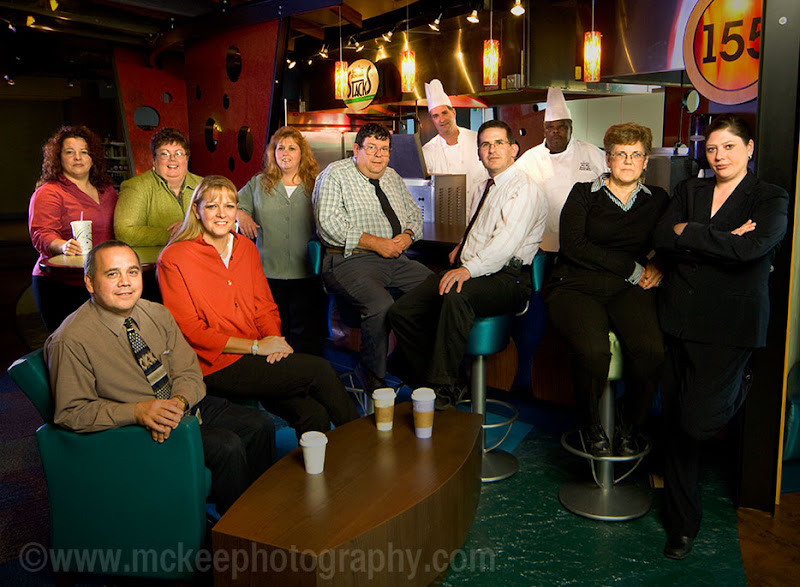
Where to Photograph 11 People?

mckee_071030_4067a.jpg

"Oh, the group portrait? We needed to add a few people. We have 11 now."

Frustrating? Actually, exhilarating!

How do you create a group portrait for marketing purposes, anyway?

For me and my team, unless there is an extremely compelling reason, we try to stay off the plain, vanilla hung background and find something interesting in the environment. Something that will talk about the team we are photographing.

In this case, the end client ran a restaurant style dining hall. It was a well designed and lit space, with interesting colors and graphic elements. It also allowed us to build layers into the composition.

We balance the daylight, ambient and added a couple of strobes to punch up the dark areas and then started adding the people in one by one. All in all, it was about a two hour set up to complete.

Was it worth the time it took? The best answer I can think of to that is to think like a magazine editor. If you were laying out an article about these folks and wanted to get the readers' attention, what would you put on the cover: a couple of plain headshots or an image with rich colors that tells the story? What would you want to see if you were reading the story?


Friday, November 02, 2007

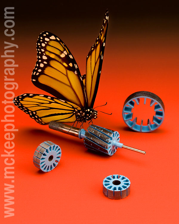
Looking for Bug Props

mckeephotobutter.jpg

I am on a search for bugs to be used as scale for product photography.

I have done some looking around and found lots of ready made framed and mounted pieces that are beautiful but the bugs don't come out easily. And they are often in the wrong position.

I know, I could take the time to learn to pose them myself, but, like everything I do with photography, I prefer to surround myself with people who are great at what they do. It means that the final result is so much better.

This specimen above has been used in a number of shoots but is starting to get pretty ragged. He doesn't have any legs left and there is only a half an antenna left. Poor guy needs to be retired.

If you have access to someone who can pose a butterfly, bumble bee, dragonfly or lady bug, get in touch with me.

Thanks!

Thursday, September 27, 2007

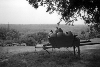
Autumn in New England

Pumkin 2093-2-7.JPG
The seasons keep on turning. This image was created on an orchard near Damariscotta, Maine. It was a perfect, fall day for picking apples and going on a photo safari.

So far, it has been used in a series of direct mail pieces and greeting cards as a stock image.

This is another from the Way I See It folder. It will be on display and for sale this weekend at the Jamaica Plain Open Studios.

In the mean time, I am off to create a series of product images today. It will be a nice day to play in the studio!

Monday, May 14, 2007

Posters and Composites

One of my constant inspirations is the art of the movie poster. Where else does the art of compositing come together to express the idea of a two hour span of time? It makes heros and villans larger than life. It conveys the central theme and drama (or comedy or whatever) to an audience through the common visual language. It is a dialog that happens in one composition.

For a while now, I have been exploring this art with a local community theater. (Yes, the same one that I just completed a 31 portrait series of its members. You can still order the book by clicking the link to the right.)

Once again, I was able to team up with Kristin MacDougall, on of the fine producers at the Footlight Club, and we brainstormed a poster design for Vampire Lesbians of Sodom and Sleeping Beauty or Coma, two Charles Busch plays.

Principle photography took place over a few short hours, photographing the available actors, in costume, on a white background. Compositing and final design, however, took around 6 hours to put together the poster and banner to advertise the show.


This makes my sixth poster series for the club and I look forward to our next project together!

sponsor