Showing posts with label Product photography. Show all posts

Wednesday, April 29, 2009

Anatomy of a Product Photo Shoot - Part A - Begin at the End.

productshotA.jpg
I believe that a photoshoot, whether for a product illustration, corporate portrait, or annual report cover, starts with the vision of the final image. Begin at the end, as it were. Ansel Adams called it "previsualization" and it is what makes the difference between a great image and hours of fumbling around in a dark studio.

The first thing I ask my clients, when they come to me with a shoot idea is, "where is the picture going to be used?" Almost always, they have a specific plan as to why they want this image. It could be a brochure or sell sheet, web page or direct mail card. Or a combination of many uses.

How they plan to use it is very important to how we create the image. If the image is solely going to be used in a product catalog, then the image needs to be designed so that it can share attention on a page with other products.

However, if it is for a press release or publicity release about the product or company, or if it is for an ad or trade show sell sheet, then the final photo illustration has to practically jump off the page to get a potential buyer's attention.

The plan and rational for each decision about why we are making the image directly impacts how we produce the image.

More about the Anatomy of Product Photography next time!

Tuesday, February 24, 2009

It's just a simple Product Photograph!

art_deco_lamp.jpg

Well, yes... and no!

A product photograph, from our little photo studio, just outside of Boston, is almost always a combination of collaborative thinking, careful interviewing and preplanning.

This beautiful, art deco style lamp would look good on almost any background. However, looking around the show room during our initial conversation with the client, we quickly decided that the image needed to carefully reflect an old world warmth and quality.

Back at the studio, we pulled out a canvas background we had created a while back. It consisted of an application of a material called Instant Rust. I had remembered that the application had turned out with a nice, painterly quality that reminded me of the old masters' paintings of bowls of fruit and other still life compositions.

The lamp itself, with its round top, projected a warm glow that we needed to imitate in the shot. Also, with all that chrome, we needed to figure out how to create smooth, uninterrupted highlights.

The set was built in a small room, with the 4'x8' canvas swept out across the floor. A strobe head with a grid and warming gel was targeted on the background and adjusted so that the light looked like it was coming from the lamp. A second strobe, shot through a 3'x6' sheet, became our main light to the right of the camera. And, a large white card was added on the left to give us the highlight on the left side of the shaft. Some time was spent balancing the exposure for the incandescent bulb in the lamp and the strobes.

There was a conversation about the light switch. Do we show it or not? Since it was, ultimately, part of the design and usability of the product, we included it.

Monday, February 09, 2009

Digital Illustration in Product Photography

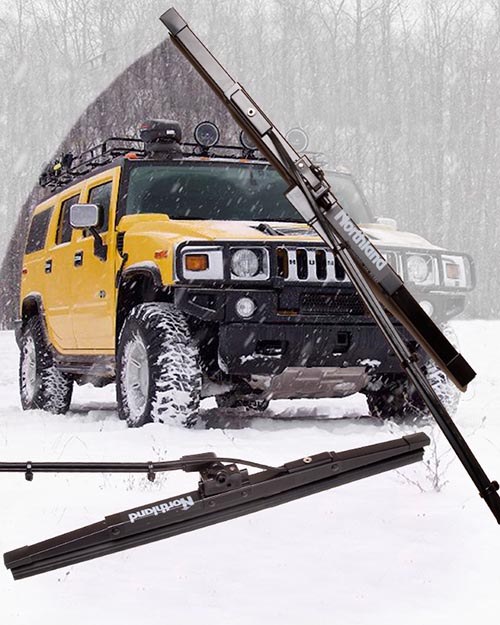
Product Illustration by Matt McKee Photography


Pre planning a product photograph is the best way to get the maximum impact for your buck.

Many of the conversations I have with potential clients start out with them calling me up and asking, "How much?"

And, I always feel a little bad when I have to ask "For what?"

I am not being a wise guy. I am not making fun of them. I am simply trying to identify what their goal is for the product shot.

For example, the digital illustration above was created to be used with a press release that would go out to all of the automotive trade magazines. Our goal, therefore, was to create an image that would appeal to the magazine editors.

It had to:
  • be more than a simple documentary photo of the product on white.

  • illustrate what the product looks like.

  • illustrate what problem the product solves.

  • be shown in a way that the target audience would understand.


  • The shot would also be used for their catalog and other sales collateral. But, since the editorial use came first, that was what we designed and optimized the photograph for.

    We started with a "napkin" plan, a sketch of the elements of the shot jotted down on a piece of paper. This was our blueprints for the rest of the production. Without this step, we could have spent hours or even days, going back and forth, trying to come to a meeting of the minds, wasting time and money.

    Instead, we knew what angle the client liked best angle, we knew where the "sweep" should be. And, we knew what kind of a stock shot in the background would appeal to our target audience.

    The setup, in my small photo studio, just outside of Boston, was fairly simple. We only had one wiper, since this was a prototype. We shot it twice, using a nice broad light to give us smooth highlights. In post production, we set up the stock background and knocked out the background on the two wiper shots.

    The whole shoot and post production was around three hours. But, we couldn't have done it that quickly, or efficiently, if we hadn't started with a plan.

    Friday, February 06, 2009

    Boston Product Photography Blog restart

    fireman_mckeephoto.jpg


    Okay, so I really haven't been slacking here, despite what you may think. My studio is a multifaceted beast that takes on all kinds of photography and photo illustration projects. For the last however many months, I have been redeveloping the mckeephotography.com site to more fully reflect one particular side of my commercial photography.

    And, while we were at it, we started another blog at blog.mckeephotography.com to show off some of our more digitally manipulated and conceptual images, many of which are also available as stock photos from photoshelter.

    So, why are we resurrecting the blogspot photography blog? One thing we do a lot of here in my little photo studio in Dedham, is capture the functionality of a product.

    I like to think of it as table top photography that is designed to illustrate the soul of an engineer's or entrepreneur's design. The product shot needs to show the audience why the widget was thought up and what problem it solves.

    Not always an easy task and even the simplest looking photo goes through a lot of thought and back and forth before we start setting up.

    Stay tuned, gentle readers, and we will talk about product photography in the future posts!

    Monday, October 06, 2008

    Swimming in a Fish Tank

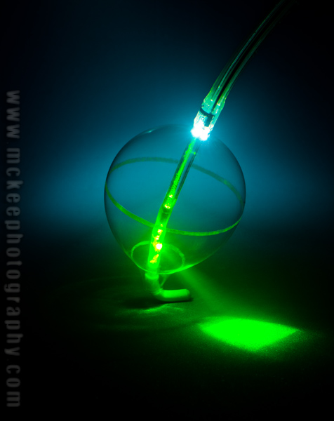
    Cardiofocus.jpg

    So, how do you get a picture of Cardiofocus's latest Laser Ablation tool?

    Start with a 30 gallon fish tank. Add a background. Add about 30 cc's of 2% milk. And then start playing with light!

    Just remember, electricity and water make for a very, erm, shocking combination.

    Friday, November 02, 2007

    Looking for Bug Props

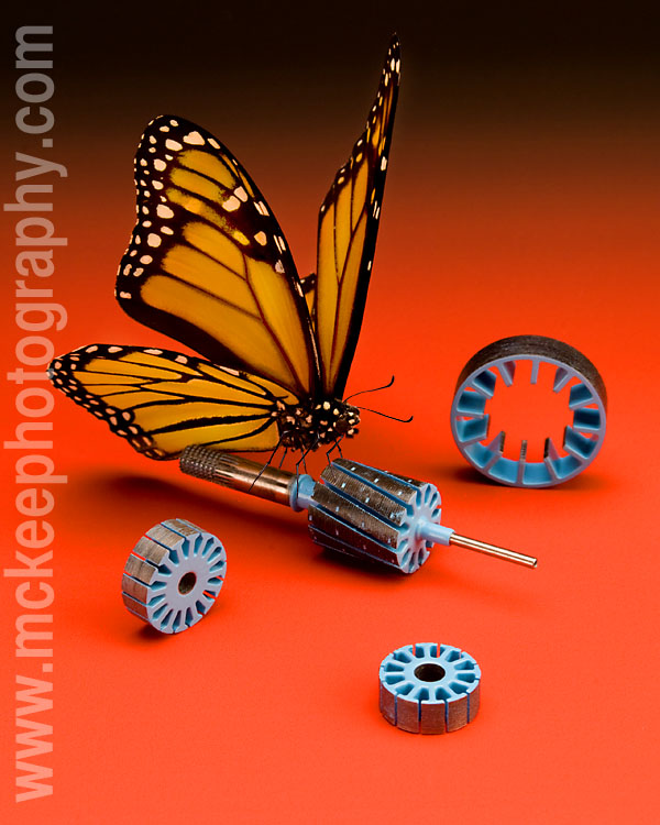
    mckeephotobutter.jpg

    I am on a search for bugs to be used as scale for product photography.

    I have done some looking around and found lots of ready made framed and mounted pieces that are beautiful but the bugs don't come out easily. And they are often in the wrong position.

    I know, I could take the time to learn to pose them myself, but, like everything I do with photography, I prefer to surround myself with people who are great at what they do. It means that the final result is so much better.

    This specimen above has been used in a number of shoots but is starting to get pretty ragged. He doesn't have any legs left and there is only a half an antenna left. Poor guy needs to be retired.

    If you have access to someone who can pose a butterfly, bumble bee, dragonfly or lady bug, get in touch with me.

    Thanks!

    Tuesday, October 24, 2006

    The Cut Ups

    I got looking back through some of my old images this morning, while procrastinating calling clients.

    I came across a series I did for a local magazine. There were eight or ten products in all, photographed in pieces, printed out and taped together.

    It got me thinking about where I had started in this business and where I was going. Like so many photographers who have been weaned off film for digital, I thought about techniques that we had used in the past but were no big thing now.

    It will be very interesting to look back in ten years at what we think of as cool now.

    What will be out? What will be in? What defines retro then?

    Somedays, I miss film. But, most of the time I don't.

    Does that mean I spend most of my time looking ahead? What about today?


    Images ©Matthew McKee
    Model: Julie Gilmartin
    Makeup: Cynthia Murphy
    Jacket by Harley Davidson

    Friday, September 15, 2006

    September Image

    Spiral #3, Limited Edition, Archival Pigment Print, 10x14

    This is part of a new, personal series I am working on, called "Found on the Beach."

    For years, I have wandered parts of the coast line along the eastern seaboard, collecting bits of this and that. Unfortunately, the earlier items were lost as my parents edited my collection or disappeared during the several moves that we all go through. But a significant portion still remains, hiding in boxes or under the dust on my shelves.

    And, during this past summer's vacation, my two boys have started creating their own collections.

    So, it was time to do something with these fossils and rocks.


    Shell #3, Limited Edition Archival Pigment Print, 10x17

    These images are a few of the collection, and I hope to continue the series over the winter.

    Stay tuned for more!

    sponsor