Showing posts with label commercial photography. Show all posts

Wednesday, April 29, 2009

Anatomy of a Product Photo Shoot - Part A - Begin at the End.

productshotA.jpg
I believe that a photoshoot, whether for a product illustration, corporate portrait, or annual report cover, starts with the vision of the final image. Begin at the end, as it were. Ansel Adams called it "previsualization" and it is what makes the difference between a great image and hours of fumbling around in a dark studio.

The first thing I ask my clients, when they come to me with a shoot idea is, "where is the picture going to be used?" Almost always, they have a specific plan as to why they want this image. It could be a brochure or sell sheet, web page or direct mail card. Or a combination of many uses.

How they plan to use it is very important to how we create the image. If the image is solely going to be used in a product catalog, then the image needs to be designed so that it can share attention on a page with other products.

However, if it is for a press release or publicity release about the product or company, or if it is for an ad or trade show sell sheet, then the final photo illustration has to practically jump off the page to get a potential buyer's attention.

The plan and rational for each decision about why we are making the image directly impacts how we produce the image.

More about the Anatomy of Product Photography next time!

Monday, March 09, 2009

I love the photograph but what do I do with it?

motorcycle1_mckeephoto.jpg
I get this question sometimes, when I am talking about my photography to owners of companies who are, understandably, more concerned about making payroll than discussing where art and commerce intersect (that's marketing at its finest, folks!). I also get it from graphic designers who are used to responding to orders from their clients.

Yes, I get that not every photograph has to be a museum piece. Sometimes, a product is just a product. But, shouldn't the photoshoot be the best value that you can get?

I don't mean "spend as much as you can." That would be silly, self serving, and, ultimately, deadly for my business.

The value, as any entrepeneur can tell you, is not just in the final object (photo, product, whatever). It is in the process, in the plan, and in the execution.

Many times, the story I have been told runs like this: "We did it ourselves. Twice. And, it was okay but...[retouching fees, didn't look quite like x...] "

Or: "We found this picture online. It was short money. We put it on the cover of our brochure. [So did our competition, it was too generic, it wasn't our product/people/service]."

Even worse: "We downloaded this picture from someone's photo sharing site. And, now we have a cease and desist letter, plus a court date."

So, you love the portfolio, but it isn't quite your product type/looks real artsy/looks expensive. That's okay.

What you do with it is use it as a conversation starter. Find a photo that is nice and ask the photographer the key question: "If you were going to photograph my product, how would you approach it?"

If the photographer asks about the goal of the photograph, the value of the image to you, your company and your potential customers, you have someone who will collaborate with you and work the intersection of art and commerce to your advantage!

--

The picture of the custom built motorcycle above was created in an iron fabrication company down in Rhode Island a few years ago. We used a combination of light sources to get the nice highlights, including a 12' by 12' silk on two high boy stands on the camera left. On camera right was the biggest softbox I had in my collection. Various white and silver cards were distributed around to keep the highlights clean. A smoke machine gave us the atmosphere in the background and the light streaming in through the windows was courtesy of Mother Nature.

Tuesday, February 24, 2009

It's just a simple Product Photograph!

art_deco_lamp.jpg

Well, yes... and no!

A product photograph, from our little photo studio, just outside of Boston, is almost always a combination of collaborative thinking, careful interviewing and preplanning.

This beautiful, art deco style lamp would look good on almost any background. However, looking around the show room during our initial conversation with the client, we quickly decided that the image needed to carefully reflect an old world warmth and quality.

Back at the studio, we pulled out a canvas background we had created a while back. It consisted of an application of a material called Instant Rust. I had remembered that the application had turned out with a nice, painterly quality that reminded me of the old masters' paintings of bowls of fruit and other still life compositions.

The lamp itself, with its round top, projected a warm glow that we needed to imitate in the shot. Also, with all that chrome, we needed to figure out how to create smooth, uninterrupted highlights.

The set was built in a small room, with the 4'x8' canvas swept out across the floor. A strobe head with a grid and warming gel was targeted on the background and adjusted so that the light looked like it was coming from the lamp. A second strobe, shot through a 3'x6' sheet, became our main light to the right of the camera. And, a large white card was added on the left to give us the highlight on the left side of the shaft. Some time was spent balancing the exposure for the incandescent bulb in the lamp and the strobes.

There was a conversation about the light switch. Do we show it or not? Since it was, ultimately, part of the design and usability of the product, we included it.

Monday, February 09, 2009

Digital Illustration in Product Photography

Product Illustration by Matt McKee Photography


Pre planning a product photograph is the best way to get the maximum impact for your buck.

Many of the conversations I have with potential clients start out with them calling me up and asking, "How much?"

And, I always feel a little bad when I have to ask "For what?"

I am not being a wise guy. I am not making fun of them. I am simply trying to identify what their goal is for the product shot.

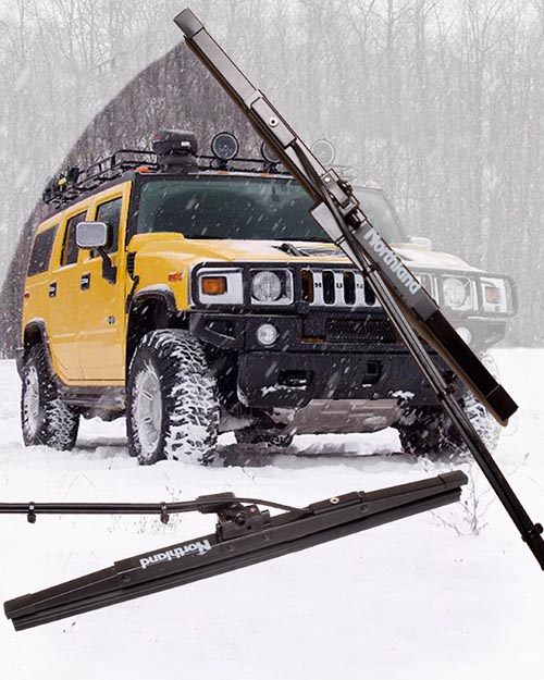
For example, the digital illustration above was created to be used with a press release that would go out to all of the automotive trade magazines. Our goal, therefore, was to create an image that would appeal to the magazine editors.

It had to:
  • be more than a simple documentary photo of the product on white.

  • illustrate what the product looks like.

  • illustrate what problem the product solves.

  • be shown in a way that the target audience would understand.


  • The shot would also be used for their catalog and other sales collateral. But, since the editorial use came first, that was what we designed and optimized the photograph for.

    We started with a "napkin" plan, a sketch of the elements of the shot jotted down on a piece of paper. This was our blueprints for the rest of the production. Without this step, we could have spent hours or even days, going back and forth, trying to come to a meeting of the minds, wasting time and money.

    Instead, we knew what angle the client liked best angle, we knew where the "sweep" should be. And, we knew what kind of a stock shot in the background would appeal to our target audience.

    The setup, in my small photo studio, just outside of Boston, was fairly simple. We only had one wiper, since this was a prototype. We shot it twice, using a nice broad light to give us smooth highlights. In post production, we set up the stock background and knocked out the background on the two wiper shots.

    The whole shoot and post production was around three hours. But, we couldn't have done it that quickly, or efficiently, if we hadn't started with a plan.

    Friday, February 06, 2009

    Boston Product Photography Blog restart

    fireman_mckeephoto.jpg


    Okay, so I really haven't been slacking here, despite what you may think. My studio is a multifaceted beast that takes on all kinds of photography and photo illustration projects. For the last however many months, I have been redeveloping the mckeephotography.com site to more fully reflect one particular side of my commercial photography.

    And, while we were at it, we started another blog at blog.mckeephotography.com to show off some of our more digitally manipulated and conceptual images, many of which are also available as stock photos from photoshelter.

    So, why are we resurrecting the blogspot photography blog? One thing we do a lot of here in my little photo studio in Dedham, is capture the functionality of a product.

    I like to think of it as table top photography that is designed to illustrate the soul of an engineer's or entrepreneur's design. The product shot needs to show the audience why the widget was thought up and what problem it solves.

    Not always an easy task and even the simplest looking photo goes through a lot of thought and back and forth before we start setting up.

    Stay tuned, gentle readers, and we will talk about product photography in the future posts!

    Monday, September 08, 2008

    High tech toys

    mckee_080403_0150.jpg


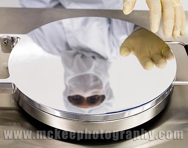
    High tech labs are always interesting to walk into. This one was for Cambridge Nanotech. They are developing ADL technologies for other industries. What, exactly, this means, I am not too sure. (Hey, I said they were cool. I didn't say I knew what the machines were doing! ;-))

    However, the machines are shiny and the clients are proud of their accomplishments. Between the marketing director and myself, we came up with a set of images that will help to convey this pride and passion for their products.

    Monday, August 25, 2008

    Meet NESSC

    mckee_080620_9295.jpg

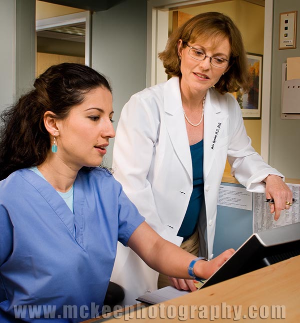
    Meet Gabe. Meet Dr. Raynhem.

    Soon, there will be a new web site for Dr. Raynhem's practice, along with new collateral pieces featuring images like this one, showing the staff as real people, interacting with each other and with the patients.

    This was a fun project, made all the better for the fact that we had worked together on Dr. Raynhem's first marketing projects two years ago, when we turned her kitchen into a medical office for the day!

    This project also gave me an opportunity to work with Margina Dennis again. She is a very talented hair and makeup artist and an asset to any shoot.

    Monday, June 02, 2008

    The Monkeys #2

    AITTmckee_080515_7813.jpg

    All in the Timing, Poster Shoot OutTake. Brad Reed, an actor to watch.

    One of my guilty pleasures is working with actors. They make it so easy to create fun and interesting images to market their productions!

    Brad Reed, who is making his debut on the Footlight Club stage, had us rolling behind the camera.

    Stay tuned! I have one more before I reveal Christine Conrad Lane's poster design!

    Tuesday, May 27, 2008

    More fun than a barrel of...

    Monkeys.

    All in the timing1mckee_080515_7743.jpg


    Just finished up another poster for the Footlight Club for their production of All in the Timing. The idea for the poster came from Kristin MacDougall, who loaned me the script for a quick read before the shoot.

    I shot ice coffee out of my nose inside of 2 pages.

    Christine Conrad Lane did the design work on the poster, which I will show you next time. She did awesome work, as always.

    It looks like All in the Timing is going to be a fantastic show so go get tickets now, if you are planning to be in the Jamaica Plain area in the next few weeks.

    Rob Guptill is the actor featured above.

    Monday, May 05, 2008

    Power Lunch- Redefined

    POW-Posters21.jpg

    Ah, kids.

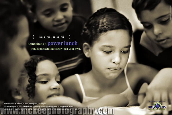
    Brian Heil, over at Hue Brand Group, creative directed this project, for a non-profit reading program. We had a lot of fun playing with the kids and they, I think, had a lot of fun with us.

    The challenge, as always, is to keep their attention span. Or, at least, direct their attention to what we need to accomplish.

    I learned a lot from this shoot. One of the kids taught me some of the worst knock knock jokes ever!

    Wednesday, April 30, 2008

    Create Magazine's Editor's Choice --Correction

    08_ECA_WinnerBug_72dpi.jpg
    createFAll07.jpg
    Whoops! I guess people really do read my blog. I was just informed that the picture I posted in the first press release was one of the nominees but not one of the winners.

    And, not to brag, but I got two Advertiser Awards!

    Both of the ads were put together from images created to promote the Footlight Club, America's Oldest Community Theater.

    This one was for their production of Charles Busch's classic spoof of Vampire Lesbians of Sodom and Sleeping Beauty or Coma.

    In a rather bizarre turn of events, right before we concepted this poster, A&E ran a show about Mr. Busch and introduced me to his creatively spoofy world.

    I had had an opportunity to come up with a poster for the Club's earlier Busch production of Psycho Beach Party.

    The best part of these productions is working with comedic character actors. Rodney Raftery and Eric Greimann were a blast to work with and the difficult part was narrowing down which images to use.

    FOR IMMEDIATE RELEASE

    MATTHEW MCKEE PHOTOGRAPHY WON THE AD MOST LIKELY TO GRAB YOUR ATTENTION AWARD AND THE BEST SHOT AWARD IN CREATE MAGAZINE’S EDITOR’S CHOICE AWARDS

    Orlando, FL, April 16, 2008 – Matthew McKee Photography won the A Most Likely to Grab Your Attention and Best Shot crowns in Create Magazine’s Editor’s Choice Awards. Engel conquered tens of other candidates to earn the title and was selected based on their originality and unstoppable design. The award-winning works dazzled the world in the Sep+Oct 2007 Northeast issue and the May+June 2007 Northeast issues respectively.

    “Matthew McKee Photography produces consistently stimulating and innovative ads that never cease to impress,” said Create Magazine Editor Dana R. DeLapi. “Their work is always impressive and perfectly complements the message of Create Magazine.”

    Create Magazine has seen some fantastic creativity grace its pages in the last year. From advertising to design, writing to gadgets, the Create Team has singled out the best of the best in a showcase for the May+June 2008 issue. With fun quirky categories like “Most Likely to Make you LOL,” the Editor’s Choice Awards provide recognition based on a different set of criteria.

    The May+June issue of Create Magazine will be on newsstands on May 12, 2008. Create is also available online at www.createmagazine.com for Create Magazine subscribers and Create Network members.


    Tuesday, April 22, 2008

    Create Magazine's Editor's Choice Award

    08_ECA_WinnerBug_72dpi.jpgcreatemarch2007b.jpgHey, Wow! Thanks!

    FOR IMMEDIATE RELEASE

    MATTHEW MCKEE PHOTOGRAPHY WON THE AD MOST LIKELY TO GRAB YOUR ATTENTION AWARD AND THE BEST SHOT AWARD IN CREATE MAGAZINE’S EDITOR’S CHOICE AWARDS

    Orlando, FL, April 16, 2008 – Matthew McKee Photography won the A Most Likely to Grab Your Attention and Best Shot crowns in Create Magazine’s Editor’s Choice Awards. Engel conquered tens of other candidates to earn the title and was selected based on their originality and unstoppable design. The award-winning works dazzled the world in the Sep+Oct 2007 Northeast issue and the May+June 2007 Northeast issues respectively.

    “Matthew McKee Photography produces consistently stimulating and innovative ads that never cease to impress,” said Create Magazine Editor Dana R. DeLapi. “Their work is always impressive and perfectly complements the message of Create Magazine.”

    Create Magazine has seen some fantastic creativity grace its pages in the last year. From advertising to design, writing to gadgets, the Create Team has singled out the best of the best in a showcase for the May+June 2008 issue. With fun quirky categories like “Most Likely to Make you LOL,” the Editor’s Choice Awards provide recognition based on a different set of criteria.

    The May+June issue of Create Magazine will be on newsstands on May 12, 2008. Create is also available online at www.createmagazine.com for Create Magazine subscribers and Create Network members.

    This was one of the ads. The image was from one of the poster campaigns for the Footlight Club, during their production of Charles Buch's Psycho Beach Party.

    Monday, April 21, 2008

    Izzi's in the House!

    mck_061216_0433.jpg

    It is amazing to me to watch kids work at things that excite them.

    They bring so much passion to a project. Sometimes they bring a little chaos as well, but not so here.

    Izzi, who's parents are involved in productions at the Footlight Club, came to the shoot fully prepared. In fact, she asked Joy, my stylist and make up person on set, about where paint should be placed on her shirt to make it more effective and authentic.

    She was fully engaged in her portrait and a great collaborator!

    Monday, April 14, 2008

    Industrial Lighting and Adapting Photography

    mckee_080213_0286B.jpg

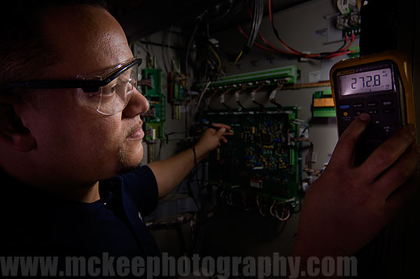
    So, there we were, in a dark room, with a gazillion volts of electricity stored in huge banks of batteries. High voltage signage everywhere. A deep hum, charged with menace, replaces the whir of ventilation fans from the data center we were just shooting in.

    We went from brilliant flat lighting to almost no lighting at all. And, the concept called for shooting into a dark cabinet, while the technician does... well, whatever they do in there. (When I asked him, he said, "Mostly, we try not to get zapped!")

    I looked up and saw three different tubes of flourescent lighting, two tungsten cans and something that may have been a mercury vapor.

    I looked at my assistant, who shrugged back at me, and I said, "Get the secret weapon!"

    Under the technician's careful supervision, we tucked it back in the cabinet and plugged it in. Added a couple of gelled lights and reflectors around the outside and started shooting.

    So, what is the secret weapon? An LED worklight from the hardware store.

    Perfect for those hard to reach, tucked in spaces, to add dimensionality to any photoshoot!

    Friday, March 21, 2008

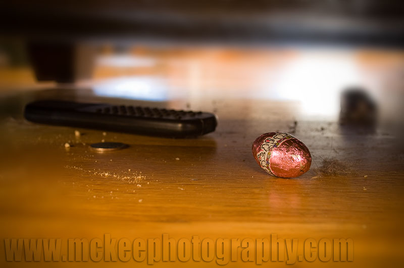
    The rabbits have invaded my home!

    MCKEE_080321_0911.jpg


    Omg, it's rabbit season again!

    Every spring, they show up on a certain Sunday morning and leave little chocolate droppings around the house for the kiddies to find.

    Jacked up on said chocolate, the kids spend the rest of the day climbing the pews at church and then fighting amongst themselves for the last morsel to stave off the inevitable sugar crash.

    And, of course, there is always that one little foil covered confection that comes out, covered in dust bunnies and cobwebs, wearing last years (or the year before?) colors.

    It was hiding behind the remote that was lost two tvs ago.

    Wednesday, March 19, 2008

    A Stock Conversation

    anythingcole1.jpg

    Last week, I was in a meeting with a medium sized ad agency art buyer, showing her samples of my black and white work. She got enthusiastic about the work and started rattling off projects where this work would be appropriate.

    As I watched, her face fell a bit when she tagged the conversation with, "But, we are having a hard time getting them away from royalty free stock images. Despite the fact that the images they choose keep showing up in [their competition's] collateral and ads."

    I had another conversation over the phone with a head of a small design agency. She said that they used royalty free stock all the time. Yes, the images would show up in other companies' marketing materials. But, none of her clients were national, so it didn't really matter.

    During a coffee conversation with an art director, he lamented that he was spending hours retouching and repurposing stock images to fit marketing concepts. By the time he was finished, he was billing as much in retouching fees as a custom shoot would have cost. And, the image still looked enough like the original that 5000 brochures were recycled when it showed up as the back wall of the competition's booth at a trade show.

    I am not one to jump up and down and try to convince you that stock is bad and evil. It isn't. And, in some places, it is very appropriate. Even the royalty free stuff. Sometimes.

    However, if you are working hard, spending lots of money and energy, trying to differentiate yourself - your company - from everyone else within your market, what is going to happen when the big national financial firm across the street is using the same image for their brochures that you have for yours?

    Original marketing photography, like every other element of a company, is an investment. There is no get rich quick scheme. There is no short cut. There is no silver bullet.

    And, in marketing, the payoff is directly related to your investment.

    Great, original work will get you recognized. Great, copycat work... will get the other folks recognized...

    The original image above was created to promote a production of "Anything Cole".

    Friday, February 22, 2008

    Marketing Concepts Over Breakfast or My Favorite Morning Reads

    SimRacingPoster.jpg

    Each morning, my boys and I sit at the breakfast table and talk about the coming day (if I have had enough coffee) or listen to the latest tunes my eight year old had found on iTunes (if I have had enough coffee). My wife leaves earlier than we do so we have the house to our selves.

    While waiting for the school bus, I surf through a variety of blogs to help spark my brain and maybe give me inspiration for the day.

    Here are a few favorites of mine:

    www.sinfest.net No, it isn't dirty. It is Tatsuya Ishida's cartoon about pop culture. It is an easy read and helps me get started.

    http://www.pvponline.com/ Another web cartoon that features characters about my age (or so I imagine). One of them is a mac-lovin', slacker type. Another is a troll.

    http://sethgodin.typepad.com/ If you don't know who Seth Godin is, then you probably don't do much marketing. Love or hate his ideas, they certainly can make you think. And, he is not shy about sharing ideas.

    http://blog.guykawasaki.com/ As a mac guy, how could I not like Guy. As a student of marketing, he is a must read. Think different, Dude.

    Advertising/Design Goodness Sort of a Lurzner's Archive for the internet. Inspiration and clever advertising.

    Heartstorming Ian Summer's blog about creativity. What Seth and Guy do for (to) me with marketing, Ian does with creativity.

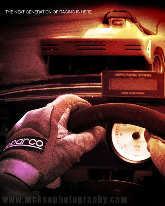
    The image above is a sandwich of two images I captured in New Hampshire. The poster was created for a software company working on a virtual racing simulator. The marketing director really liked the image but the powers that be went in a different direction, orphaning the project.

    Ah, well.

    Wednesday, February 13, 2008

    Happy Valentine's Day!

    unlockmyheart.jpg

    To a certain extent, I feel like Linus, in the Charlie Brown Christmas, except for Valentine's Day. It's all a big racket set up by a conglomerate, back east.

    Valentine's day is so commercial that it, more than occasionally, borders on the ridiculous.

    Until you drill down to the heart (no pun intended) of the celebration and remember what it is all about. Then, it can become sublime.

    This morning, I was sitting at the breakfast table, reading my morning blogs with the boys and came across Scott Kelby's wonderful web comic, pvpoline.com. (Who me? Read comics? Nah! Never! Childish pap!... er...)

    His blog entry about his father explaining to a young Kelby that he was no longer in love with his mother, that it had actually moved beyond love to something so much more, really resonated with me. I can remember a similar situation with my father.

    The image above was created a few years ago as a Valentine's Day card for my wife.

    Sunday, January 27, 2008

    Executive Portraits are marketing tools, too.

    mckee_080124_0240.jpg

    A graphic designer/marketing guru friend of mine invited me in to her office to talk about creating some portraits that would work for a marketing/branding project.

    She had observed that press releases had a higher percentage of success when an image was included. And, that the type of image presented had an almost direct influence on how big the article was presented on the page.

    She was quick to point out that there were a lot of other influences and variables that play a significant roll in the success rate as well. In no particular order: how well the press release was written, how much the release was aimed at the publication's target audience, how unique the article was, what other news, happenings or releases were competing for the same space, how much the editor had on his/her plate when the release came in, how much work they had to do to make the article work, etc...

    We talked about the pros and cons of different types of headshots. The most common type are the studio shots, on neutral backgrounds, sometimes on a painted background. They are literally head and shoulder images. The pros are that they can be done fairly quickly and inexpensively. Several people can get theirs done if the photographer comes out to the office and can set up in a convenient conference room. Everyone's image looks pretty much the same, which works well for proposal documents, web bios etc.

    The cons start with everyone looking the same. Not only do they look the same for the office, they often look the same as everyone else's in the world. Some nicknames for these images are school photos, passports and drivers license photos. Also, because speed is an issue, sometimes people don't look their best ie: unwrinkled cloths, matching cloths, hair, shiny faces, etc.

    The next level up was studio style but with the addition of a stylist/groomer. The sessions for each person go a little longer but they end up looking much better.

    2428_k_122.jpgIn an image that relies totally on the person's personality to shine through (remember: generic, neutral backgrounds, no props etc) every little bit helps to make the shot more effective.

    Another con that came up was that these images, if published, will only get postage stamp size space in the publication. If you are looking for a cover story or a full page section opener or even a half page article, these images probably won't impress an editor.

    2428_B_138.jpgSo, the other option is the custom portrait. The pros for this type of image is that you can get away from looking like everyone else and can collaborate to create an image that is an effective story telling tool for your marketing (which should be the goal of these images, right?).

    The cons? Well, it is more expensive, in the short run. There are things to consider like grooming, wardrobe, location, etc. The production time can be longer and take up more of your time. And, a big one is that the photographer will ask you to share some information that you may not have thought of. Such as, who is your audience? How do you want them to feel when they look at this image? and, how do you see your self?

    I brought these cons up to my marketing friend, having heard them from customers and potential customers for years. She said, "Yes, but they are only cons if you are afraid of success. Won't a better image be more effective and then, directly or indirectly, make you more money? Be more effective with your marketing?"

    What could I say to that?

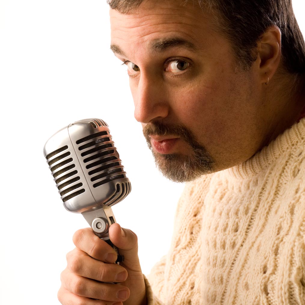
    The big picture above is a direct result of that conversation. I can't reveal who it is for yet, but... The smaller pictures were done for Cambridge Healthtech Advisors. They opted to do both types of images to give them more marketing flexibility.
    Tuesday, January 15, 2008

    Restaurant Symetry

    fireplace.jpg

    A while back, I had the privilege of creating image for the Fireplace Restaurant in Brookline.

    This was one of my favorite images from that project.

    sponsor